Cosmetics and Beauty Branding Graphic Design
Project Overview
Jurlique, a leading Australian cosmetics manufacturer specialising in natural botanical-based skincare and cosmetics, approached Graphic Design Newcastle for a refreshed brand identity. The goal was to better reflect the company’s holistic values, premium positioning, and sustainable product line in a highly competitive beauty market.
Client Background
Jurlique is renowned for crafting skincare and beauty products from naturally derived ingredients grown on its biodynamic farm in South Australia. Known for blending science and nature, the brand has earned a loyal following both locally and internationally. As they continued to evolve, a refined and modern visual identity was essential to maintain relevance and attract new audiences.
Objectives
- Refreshing the visual identity to align with premium natural skincare positioning
- Highlighting the brand’s botanical and sustainable foundations
- Creating consistency across packaging, digital, and print materials
- Enhancing shelf appeal and digital brand presence
- Building emotional connection through a soft, elegant visual tone
Design Strategy
Graphic Design Newcastle approached the project with a strategy grounded in organic minimalism. Soft tones, delicate typography, and natural design motifs were chosen to reflect Jurlique’s botanical philosophy. The identity system was designed to feel fresh, luxurious, and harmonious—appealing to both loyal consumers and first-time buyers.
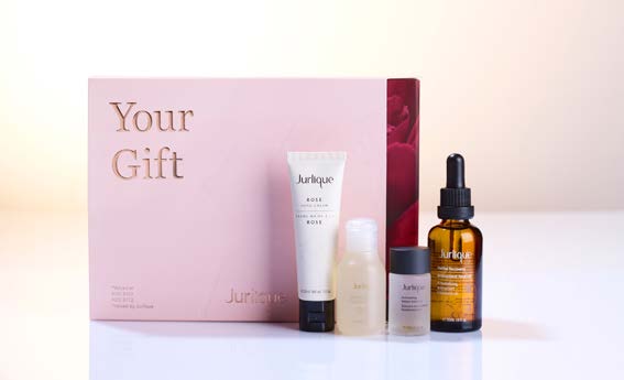
Brand Elements Delivered
- Logo Refinement: Subtle adjustments to the existing logo for modern clarity and better digital rendering
- Botanical Illustration Set: Custom artwork used in packaging and marketing to reflect core ingredients
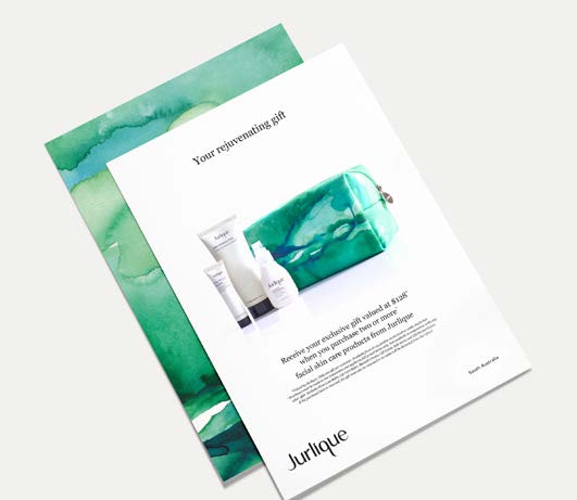
- Product Packaging Design: Updated labels, cartons, and jars with refined layouts and finishes
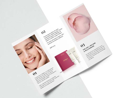
- Social Media Assets: Branded templates for Instagram, Facebook, and campaigns
- Style Guide: A comprehensive document for internal brand consistency
Digital + Print Execution
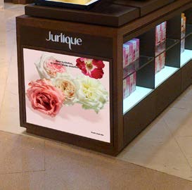
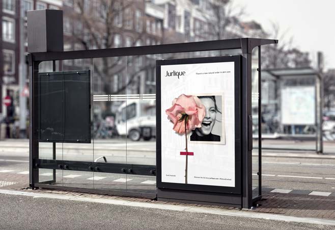
The new identity was applied across multiple touchpoints, including ecommerce packaging, store signage, social media, and promotional collateral. Particular attention was given to unifying the physical packaging experience with the digital aesthetic of the website and social channels.
Results & Outcomes
The refined identity elevated Jurlique’s market presence, reinforcing its position as a pioneer in natural beauty. The refreshed packaging improved shelf impact in retail stores, and digital engagement increased notably after the visual rollout. Internally, the new style guide provided much-needed consistency across departments.
Client Feedback
Jurlique praised Graphic Design Newcastle for deeply understanding the brand’s ethos and delivering an identity that was not only visually beautiful but also strategically aligned with their mission. The collaboration was described as seamless, creative, and deeply respectful of the brand’s values.
Looking to refresh your cosmetics and beauty brand with authenticity and elegance?
Connect with Graphic Design Newcastle for bespoke branding that blossoms naturally.